Search This Blog

Monday, May 14, 2012

Exercise: Colour relationships

This exercise provided me with plenty of challenges.  Trying to get shots of the specified colour relationships was tricky, particular as I was trying to get shots with natural colour as opposed to man made.


The first shot was taken at an aquarium and utilises the natural orange colour of the aquatic vegetation.  Although the orange is not a strong orange I think that the contrast works well.


The second shot was taken of an American fire hydrant against the very green grass,  I have cropped it so it fits the recommended proportions. 1;:1 red to green.


The third shot was the hardest to compose as I found it hard to locate a natural violet and yellow in the same circumstance so I resorted to contriving my own shot.  I used some violet material and a bright yellow lego block.


For the second part of this exercise I took and chose several shots of colour combinations that are not necessarily within the 'rules' but simply ones that appealed to me.

The first picture I am using is from a NASCAR race, the competitors all use brightly coloured cars so as to catch the eye of the spectator. This picture has a lot of contrasting colpur which works well within context.  I shot it with a telepho lens at the lowest aperture I could with a zoom so as to catch the movement and detail.


The second shot on the beach has a variety of colours some of whic hare well matched but there are pllenty that are not I think that they all work well together in the sunny composition.  The blue and orange works well but the extra colours, the red and pink give the photo an edge.


The next shot has green and orange as the feature colours the contrast between the natural and artificial green works well for me and the orange brings attention to the scene.


The final shot in this exercise is of a variety of cotton reels in a wool museum.  There is an imbalance in the colours but it works well in the context of the shot.


Wednesday, February 15, 2012

Primary and secondary colours

I found this exercise exceptionally difficult as the colours that I was trying to search for were not immediately clearly identified.  I found this particularly challenging as I was trying to complete this exercise in the winter.


For the Blue pictures I used a clear day and a shot of the blue sky.  The auto exposure recommended setting was F10.   So I shot one at F10, one at F11 and one at F9.
 F9
 F10
F11

As stated in the text, green that on  first thought would be easiest to find was indeed very difficult due to the variance of quality of the green colour throughout the foliage and other mass green areas that I tried to identify.  I eventually went for an apple.

 F5.6
 F6.3
F7.1
For the red I used a flower.  The first shot was a little disappointing and out of focus in parts.


 F6.3

F7.1
F5.6
I also used a flower for the yellow colour.  This time there was very little difference between the photographs shot at the recommended aperture of F6.3 and those at F5.6 and F7.1.

 F5.6
 F6.3
F7.1

For orange I used the centre of a carrot.
 F5.6
 F6.3
F7.1
For the purple I resorted back to the flower.  On reflection the colour is maybe a little light an and is maybe more pink than purple.

 F5
 F5.6
F6.3

Monday, December 19, 2011

Part 3. Exercise control the strength of colour

For this exercise I used a coloured path marker and filled the frame with it.  In real life the marker looked a striking blue although in the photographs the colour is far more washed out.

F8

F9

F10

F11

F13
The pictures were all take with an iso setting of 100 and a shutter speed of 1/400.
F10 looks nearest to the colour that I pictured when I was looking at the object with just my eye.  As the aperture gets higher the colours in the pictures darken and as the aperture widens the colours get lighter.

Wednesday, February 16, 2011

Exercise: Rhythms and Patterns

This first picture is of the water fountains at the Bellagio hotel in Las Vegas, taken whilst on a work trip. I think that the water fountains convey a sense of rhythm and the attractions in the background maintain the viewers interest. This was a picture of a hotel. I framed it so that there were no borders, giving the sense of an endless pattern. The result is probably a little dull and would almost certainly have benefitted from another source of lnterest in the shot such as a window cleaner.

This is another example of a pattern. This was the front window of a Chinese restaurant. The scrolls finish shortly after the left edge of the photograph. However I tried to frame it in order to convey a pattern that continues indefinitely. To improve the shot I could have also added another item of interest to it.

Wednesday, December 22, 2010

Exercise Real and Implied Triangles

Work and family commitments have meant that I have been a bit slow through the back end of this module. I have been trying to put this exercise together for sometime. Although the principle of the triangle seems very straight forward I found that parts were difficult to picture, such as the implied triangles. I experimented with various lenses and eventually succeeded in achieving some partial success.

This first photograph is of a standard triangle and was taken in the rain near a lake. The building is clearly triangular in shape and stands out in the shot.
This second photo was taken with a wide angle lens and was of the corner of my house, the angle of the camera has created a triangle of the edge of the building into the sky. There is also a natural triangle with the roof of the next door house.
I found that making this third shot was very difficult as the triangle needed to converge at the bottom of the frame. In this shot the posts are actually parallel and the effect of taking the picture from above helps with the convergence of the posts to the bottom of the frame. It would have been better if the shot could have been taken from a higher angle. Also the boy creates an implied triangle with the point converging at his feet, this effect is created because he has his arms apart.
For the attempt at the still life I tried a couple of scenarios the first was a wine rack with the wine stacked into a triangle the second was an arrangement of 4 ornaments on a mantle piece.


I prefer the wine bottle arrangement as there is a slightly more natural look, or less manufactured.

In this shot the apex of the triangle is at the bottom, thus making an inverse triangle.


The picture of my three children has an implied inverse triangle through the three of them. This is my favourite shot in this assignment as it has the most natural look to it. If I were to shoot it again I may try to get a better background and use a lower aperture to create some background blurring.

Sunday, December 5, 2010

Exercise Implied lines

For the first part of this exercise I was required to draw implied lines on the two pictures in the course literature. The first picture has an implied line in the markings on the ground lest by the bull and the implication is that the bull will continue on the same line. The second picture has two implies lines. The first is the man's eye line and the second is that of the horses. The most powerful line is that of the first horse as it dominates the frame.

I have now selected three photographs of my own that have implied lines:
The first photo is of my daughter staring onto the distance, the implies line is from her eyes into an undefined point in the distance.


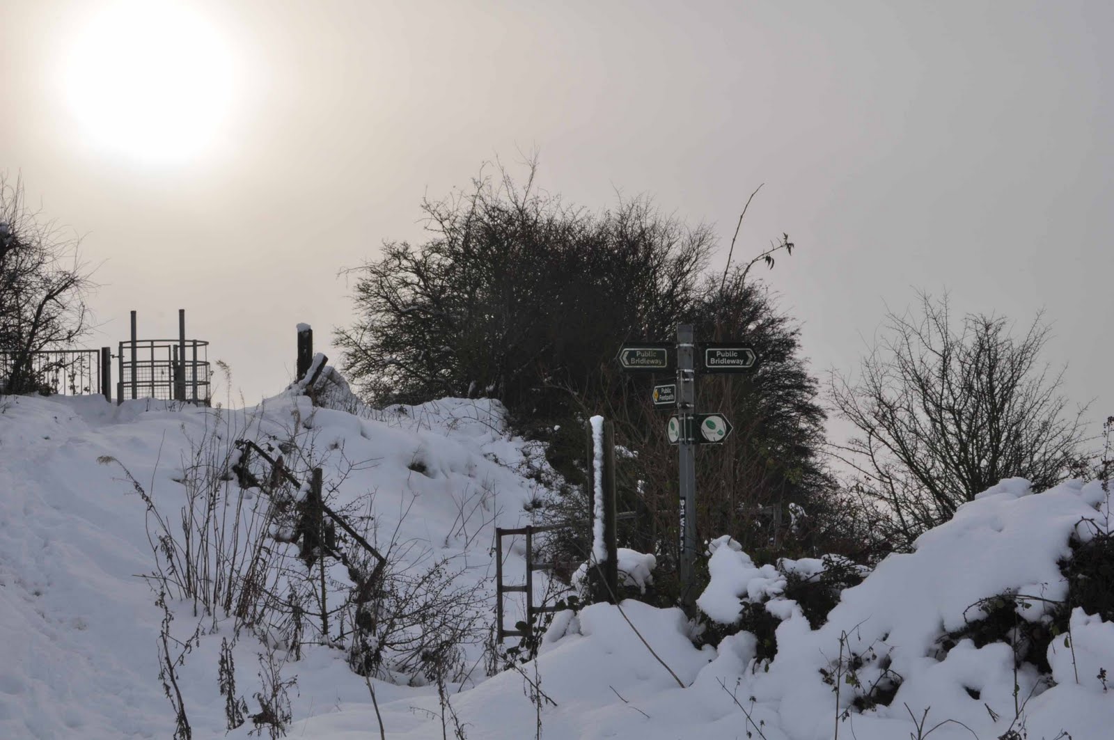
The second photo is of a sign that points in several directions, it is not the best example of an implied line as the sign and the path together would make a better example. The strongest line is the part of the sign that points into the gated field.

The third example is of my youngest son trudging through a snow filled field, the implied line is the line of his walking and the direction of his eyes into the ground and the task ahead.


For my examples I firstly tried to capture the eye line and the arm/aim line of my son throwing a snowball at his friend. You can just about see the eye line.


For the picture of the extension of lines or lines that point I have used the tracks in the snow that lead to the car in front of the house. On reflection the lines in the photograph are not as powerful as I saw them when I was constructing the photograph.


Saturday, November 6, 2010

Exercise Curves

In this exercise the requirement was to take 4 photographs with curves giving a sense of direction. Having considered the task I thought that there were some obvious curves such as roads,tracks and trails. I took several pictures and the ones that I chose cover a few of the available curve options.


The curve in the river leads into the distance and makes the eye follow it.


This is an interesting curve because the river has several reflections that also draw the eye along the river.

I am not sure whether this picture works as a curve effect as the curve is only on the edge of the bunker and does not give a sense of movement.


The curve in this track is more subtle and leads the eye into the distance, it would have been more effective with some kind of vehicle on it.