Search This Blog

Thursday, October 24, 2013

Changes to assignment 5 post tutor report.

I realise that with this assignment there were several improvements that I could make. I should have laid out the entire assignment in a different manner and in this post I will attempt to do that so it can be seen as the magazine layout.

Having reviewed the tutor's comments it was clear that I had missed some fundamental elements in my narrative.  I had also made some sloppy mistakes with the photographs in particular some of the backgrounds definitely needed some work.

I have redone the assignment as a document in the layout that I had intended, I have improved some photographs and replaced others.  Unfortunately some of the photographs that would have added to the narrative (such as shots of the competitors crossing the line) are of such poor quality that I deemed them unusable.


Tuesday, October 22, 2013

Changes to assignment 4 post feedback from tutor.

I think that assignment 4 was my best work on the course and I do enjoy the close up work and the manipulation of light.

It was quite difficult to make too many alterations based on the tutors comments due to the types of photographs.  I have attempted the following improvements where I felt able.

I was content with the Form and Shape photographs.  I have tried to make some improvements to the Texture shots.

For the first one I have tried to emphasis the texture a little more.


and for the second shot I have removed the distracting wall in the bottom corner and added some sharpening.


The only other photograph that I wanted to change is the first in the colour section.

I have tried to remove some of the shadowing that originally I had not noticed but now it has been pointed out I can see that it is distracting.  I have played around with light room selections to try and enhance the original although I am not convinced that I have made a large improvement.  I have also tidied up the background.


Changes to Assignment 3 changes post tutors report

It had taken me an awful long time to complete this assignment due to various reasons.  Once again I did not disagree with any of the tutors comments in his report.  I had found it particularly difficult to find pictures that both encapsulated the task and were of visual interest so it was not a huge surprise to find comments relating to a lack of substance in some of my shots.  I spend an awful lot of time travelling and that is often when I have the spare time to undertake the assignments so although it looks like I have been travelling the world looking for the perfect photo in reality it happens to be when I am away I have more time, in the later assignments I have tried to concentrate my efforts nearer to home.

I have made some alterations, as suggested, to some of the photographs that I took for this assignment the results are below:

Complementary Colours

I was reasonably satisfied with the first two shots in this category and although eh comments were fair concerning the red door I was not able to re-shoot it to include more interest.

The third picture in the set of I have cropped to remove the pavement and concentrate on the action surrounding the car.  I am pleased worth the result and the crop has definitely improved the photograph.


For the picture of the church I have brought the tree into the shot in order to bring some more complementary colour as suggested.

CONTRASTING COLOURS

For the Wimbledon shot I have selected one that had more interest in it than just the coloured boards.  I have selected one of the shots that I took of the players warming up with their coaches.  It is not as clear as I would have liked but it is certainly an improvement on the original.


The other shot that could be improved in this section was the Las Vegas sign.  I realise that I had over concentrated on the colours and not added the interest.  I have chosen a long range shot that includes more of the surrounding detail as suggested.


SIMILAR COLOURS

For the thistle shot I have desaturated some of the yellow away and and altered the shot from landscape to portrait in order to concentrate on the thistles and the background.

For the landscape shot I have replaced it with another shot that has the foreground subject in focus as well as the background.

COLOUR ACCENT

For the lighthouse photograph I have tried to choose a shot that has more of the environment to improve the interest to the shot.  I think that this is a better view.  With my previous photograph I was concentrating on the colour to the detriment of the content.


For the beach shot I have tried to make the girl more central to the composition.  I do think that it improve the shot although some of the far coastline detail is lost.


For the rest of the photographs in this assignment I was either content with them or unable to improve them further.

Thursday, October 10, 2013

Changes to Assignment 2 following tutors comments

The comments made by the tutor were very constructive and although harsh at times I considered them to be a fair assessment of my work.  To that end I have attempted to make the changes suggested and improvements where I thought appropriate.

For the CURVE shot I have utilised a shot of a curved structure that has more emphasis on the curves.  It was shot in a tranquillity garden.

My original DIAGONAL picture had a poor relationship with the background with distractions all through the shot.  I have altered the picture with light room to remove the background distractions in particular I have made it a much closer cropped shot.


I have left the DISTINCT IF IRREGULAR SHAPE shot unchanged.

The HORIZONTAL AND VERTICAL original shot was a poor quality photograph with little interest,  To that end I have selected another shot of some vegetables.  This a more natural less contrived shot of horizontal and vertical lines and in retrospect I much prefer it.


For the two IMPLIED TRIANGLES I have removed the distractions in the background by primarily re-cropping the photographs.


For the PATTERN shot I have taken the tutor advice and made the photograph Black and White in order to take away form the colour and form of the flower.  I think that it is a partially successful technique, the pot is still a distraction,however it I definitely believe that it does emphasis the pattern to a greater extent.

For the RHYTHM shot I have just attempted to remove the black cables from the left hand side of the shot by altering the crop.  


The SEVERAL POINTS IN A DELIBERATE SHAPE was the hardest photograph for me to capture.  My original did not meet the brief and subsequent attempts were not a lot better.  In the end I have settled for an unusual tree that has various points within it's shape.  I have made the photograph black and white to take away from the colour of the tree.


Both the tutor and I were content with the last two shots, SINGLE POINT and TWO POINTS.  I have included them in this post for completeness. I did attempt unsuccessfully to remove the burnt out sky form the second shot.


Saturday, May 25, 2013

Assignment 5


THE ART OF PHOTOGRAPHY ASSIGNMENT 5
These are the notes to accompany my photographs for the assignment 5. 
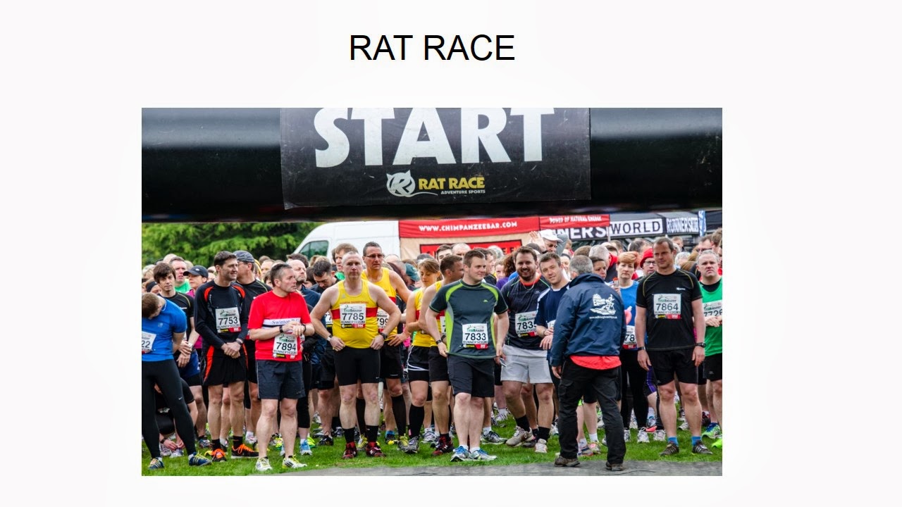
I decided to use a 10km race at Clumber Park for my assignment.  I race quite a lot myself so I am familiar with the set up and I had a pretty good idea about the photographs that I wanted to take.  I decided to use the timeline of arriving at the event to the leaving and my focus would be on the effort of the participants.  I took all the photographs with my telephoto lens as I found it the easiest lens to capture people and their expressions.
The cover photo is the one titled TRAILBLAZER, the name of the race.

1. The warm up
2. On your marks
3. Getting into a rhythm
4. It all went by a blur
5.  The face of concentration
6.  All support gratefully received
7.  The end is in sight
8.  It is all over
9.  Time to reflect
10.   Everyone is a winner!
11.  Home time
I have attempted the layout sequence on my blog.  I would lay the pictures out as follows:
1 and 2 on opposite pages.
3, 4, 5 and 6 two on a page on opposite pages.
7 and 8 on opposite pages.
9 and 10 on the same page with 11 on the opposite page.

TRAILBLAZER

 Page 1
The warm up

On your marks

 Page 2


Getting into a rhythm
The face of concentration

It all went in a blur
All support gratefully received

Page 3

It is all over

The end is in sight


Page 4

A time to reflect

Everyone is a winner!

Home time


Thursday, May 16, 2013

Part 5 Exercise 5

For the final exercise in this part of the course I needed to take a photograph that would be appropriate for the cover of a magazine with the title 'Rain'

Once again I tried a few ideas, I found rain is very difficult to photograph effectively, I did not want to take a still life as I thought the umbrella/Wellington boots shot was a little predictable.  In order to get some interest into the shot I thought of using a human face and some emotion, these types of photographs are, in my opinion, always of interest.  I decided that I would take a photograph of my son stuck inside on a rainy day.  I sprayed the window with water and had him looking forlornly outside.   After several attempts I realised that the better shot would be from outside looking in.  I used my telephoto lens concentrated on the water and get my son to look outside quite close to the glass.  The affect is of the water being in sharp focus and a slightly miserable boy being just out of focus.  I then altered the photograph to black and white in lightroom to provide a moodier look.

This is the result:

1/60, F5.0, ISO 400

Part 5 Exercise 4

I found getting a idea for this exercise pretty tricky, before I settled on a concept I tried several different set-ups  I wasn't overly keen on trying the still life composition as I couldn't formulate a decent composition in my mind.  I settled on doing an outdoor shoot and I was inspired by watching my youngest son playing with his remote control truck.  I attempted to take a photograph that had the truck in the foreground appearing larger in scale against my son I the back ground holding the remote control.  I used a telephoto lens and zoomed in in order to foreshorten the shot.

1/60, F5.6, ISO 100
I was reasonably satisfied with the result although I would have preferred a sharper image of my son in the background.

Wednesday, May 15, 2013

Part 5 Exercise 3

For this exercise I did not need to take any photographs.  I needed to match symbols to concepts and how you might use them in a photograph.

1.  Growth- Early plant life, you could take a shot of a small plant breaking earth.  Another idea would be to use a person wearing clothes that were too small and torn.  Arrows pointing up, you could use anything in a photograph of an arrow or arrow shaped object.

2. Excess- Weighing scales, a photograph of a particular high reading on weighing scales.  Lots of banknotes, jammed into a wallet or jar.  Food, a photograph of a plate with a vast amount of food piled on to it.

3.  Crime- A gun, simply lying on a table.  Handcuffs, on a persons wrists. Broken window, shown with a hand stretching through it.

4.  Silence- A finger on the lips, a photograph of just the finger and lips would be sufficient.  A library, people reading in a library with the silence please sign on show.  Tape over a mouth.  A shot of just a mouth with tape over it.  A musical note with a line through it.

5.  Poverty-   A sad child, in almost a begging pose.  An out stretched hand, palm up.  Dirty feet.


Exercise 2

For this exercise I needed to take a photograph of demonstrating evidence of action.

For this shot I chose to use a wine bottle dripping wine onto a shiny surface.  I tried several shots and a lot of them were pretty uninteresting this on is the best of the bunch.  I tried to focus on the wine dripping from the rim and let the rest of the photograph drop out of focus.

1/60, F5.6, ISO 800
I then had to think of concepts in advertising that are regularly depicted but cannot be shown directly.

For health products people are often used showing fitness and well being (smiling laughing etc).
Adverts for alcoholic drinks often show people having a good time in a public place.
Fitness products concentrate on outdoor shots often in sunshine. 
Postal services advertising efficiency by showing a parcel dropping through a door.
Anything that needs to demonstrate speed will use a fast object such Usain Bolt advertising fast broadband.

Objects that are used in advertising insurance:

Bulldog
Strong buildings/Pillars
Jigsaw pieces
Three little piggies

Part 5. Exercise 1

For this Exercise I chose to provide a narrative of an afternoon in the park.  The photographs were taken on a chilly but bright day in a local park.  I tried to capture a time shot of the arrival activity and departure.


A view of Lincoln in the park 
Setting out
Raring to go
Let's play
Heading for the goal

Where has that ball gone?

Found it!
Tired of football
Time to go
All is quiet in the park